第五章: 样条
Contents
第五章: 样条
在本章中,我们将讨论样条曲线,它是 第 3 章 中概念的延伸,旨在增加更多的灵活性。在第 3 章 中介绍的模型中,结果变量和预测变量之间的关系在整个定义域中是相同的。相比之下,样条可以将一个问题分解为多个局部的解决方案,所有这些局部解可以组合起来生成一个有用的全局解决方案。
5.1 多项式回归
正如在 第 3 章 中所述,可以将线性模型写为:
其中 \(\beta_0\) 是截距,\(\beta_1\) 是斜率,\(\mathbb{E}[Y]\) 是结果变量 \(Y\) 的期望(或均值)。可以将公式 (41) 扩展为如下形式:
上式被称为多项式回归。
乍一看,公式 (42) 似乎表示预测变量 \(X、X^2 \cdots 、X^m\) 的多元线性回归。从某种意义上说这也没有错,但关键是所有预测变量 \(X^m\) 都是由 \(X\) 的 \(1\) 到 \(m\) 次整数幂派生而来。因此,就实际问题而言,我们仍然在拟合一元预测变量。
我们称 \(m\) 为多项式的度。第 3 章 和 第 4 章 的线性回归模型都采用 \(1\) 次多项式。唯一的例外是 4.1 转换预测变量 中的变方差模型,其中使用了 \(m=1/2\)。
Fig. 87 显示了 \(3\) 个分别使用度为 \(2\)、\(10\) 和 \(15\) 的多项式回归示例。随着多项式阶数的增加,我们会得到更灵活的曲线。
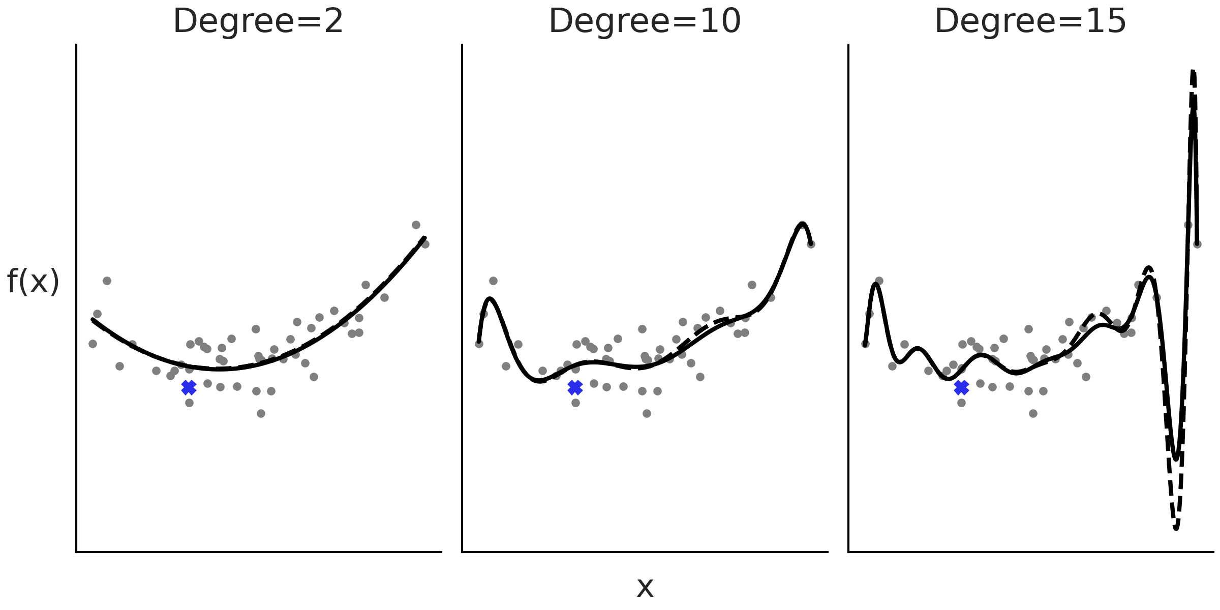
Fig. 87 度为 \(2\)、\(10\) 和 \(15\) 的多项式回归示例。随着度的增加,拟合变得更加扭曲。虚线是删除用蓝色十字表示的观测点后的拟合。当多项式的度为 \(2\) 或 \(10\) 时,删除数据点的影响较小,但在度为 \(15\) 时产生的影响比较明显。使用最小二乘法计算拟合。
多项式的缺陷之一是其全局性,当我们应用一个度为 \(m\) 的多项式时,其实是在说:“预测变量和结果变量之间的关系对于 整个数据集 而言的度是 \(m\) ”。当数据的不同区域需要不同级别的灵活性时,这会出现问题,比如在某些区域导致曲线过于灵活 1。在 Fig. 87 的最后一个度为 \(15\) 子图中,可以看到,在 \(X\) 值增大的过程中,拟合曲线呈现出一个深谷,然后是一个高峰,即便不存在相应的真实观测点。
此外,随着度数增加,拟合变得更倾向于那些被删除的点,或者等效于添加了若干未来数据;换句话说,随着度数的增加,模型变得比较容易过拟合。例如,在 Fig. 87 中,黑线表示对整个数据集的拟合,虚线表示删除一个数据点(图中用叉号表示)后的拟合。可以看到,尤其是在最后一个子图中,即使删除单个数据点也会改变模型的拟合结果,这种效应甚至延伸至了远离该点的位置。
5.2 扩展特征空间
在概念层面上,我们可以将多项式回归视为一种创建新预测变量的方法,或者表述为更正式的术语:对特征空间进行了扩展。通过执行特征扩展,我们在扩展空间中拟合的一条直线,可能代表原始数据空间中的一条曲线,非常简洁!但特征扩展并不能随意使用,我们不能总是期望通过随意地对数据使用变换,就能得到我们享有的好结果。
为了概括特征扩展的概念,可以将公式 (41) 进一步扩展为以下形式:
其中 \(B_i\) 是任意函数,我们称之为基函数。基函数的线性组合构造出一个函数 \(f\),它才是真正拟合的模型。从这个意义上说,\(B_i\) 是构建灵活函数 \(f\) 的幕后君子。
基函数 \(B_i\) 有很多选择,多项式是其中之一,也可以应用任意一组函数,例如 \(2\) 的幂、对数、平方根等。选择哪个函数通常是由待解决的问题驱动的,例如,在第 4.1 转换预测变量 节中,我们通过平方根来模拟婴儿的身高随年龄变化的函数,其动机是人类婴儿在生命早期阶段生长得更快,然后趋于平稳,和平方根函数的效果很接近。
另一种替代方法是使用 \(I(c_i \leq x_k < c_j)\) 之类的指示函数,将原始 \(\boldsymbol{X}\) 预测变量分解为若干个(非重叠的)子集。然后在这些子集内分别拟合局部的多项式。此过程导致拟合出 分段多项式 2,如 Fig. 88 所示。
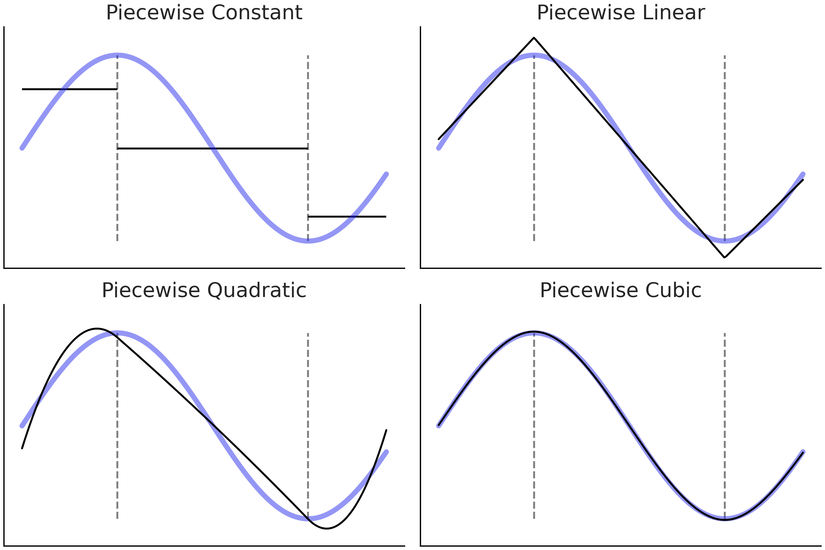
Fig. 88 蓝线是我们试图逼近的 真实 函数。黑色实线是递增阶数(\(1\)、\(2\)、\(3\) 和 \(4\))的分段多项式。在 \(x\) 轴上垂直的灰色虚线标记每个子域的约束边界。
Fig. 88 的四个子图目标相同,用于近似蓝色曲线对应的函数。我们首先将函数分成 \(3\) 个子域,由灰色虚线分隔,然后为每个子域拟合不同的函数。
在第一个子图( 分段常数 )中,我们拟合了一个常数函数,可以将其视为零次多项式。聚合的解决方案,即黑色的 3 条线段被称为 阶梯函数( step-function )。这似乎是一个相当粗略的近似值,但它可能就是我们所需要的。举个例子,如果我们想找出早上、下午和晚上的预期平均温度,则阶跃函数就可以解决问题。
在第二个子图(分段线性)中,我们执行与第一个子图相同的操作,但使用线性函数而不是常数,即它是一次多项式。请注意,相邻的两个线性解决方案在虚线处相遇,这是故意完成的。这种限制是为了使解决方案尽可能的平滑4。
在第三个子图(分段二次)和第四个子图(分段三次)中,我们使用二次和三次分段多项式。通过增加分段多项式的次数,可以得到越来越灵活的解决方案,这在带来了更好的拟合同时,也带来了更高的过拟合风险。
因为最终拟合是由局部解(\(B_i\) 基函数)构造的函数 \(f\),我们可以更轻松地适应模型的灵活性以适应不同区域的数据需求。在这种特殊情况下,我们可以使用更简单的函数(阶数较低的多项式)来拟合不同区域的数据,同时提供适合整个数据域的良好整体模型。
到目前为止,我们假设仅有一个预测变量 \(X\),但同样的想法可以扩展到多个预测变量 \(X_0, X_1, \cdots, X_p\) ( 注意:\(X_i\) 之间相互独立,见公式 )。在此基础上,我们甚至可以添加一个反向链接函数 \(\phi\) ,而这种形式的模型被称为广义可加模型 (GAM) 5 ,参见 [18, 49]。
概括一下在本节中学到的知识,公式 (43) 中的 \(B_i\) 函数是一种巧妙的统计工具,它允许我们拟合更灵活的模型。原则上,可以自由选择任意 \(B_i\) 函数,根据领域知识做探索性数据分析,并形成阶段性结果,甚至可以通过反复试验来选择 \(B_i\) 。并非所有转换都具有相同的统计属性,因此最好能够在更广泛的数据集上评估一些具有良好通用属性的默认函数。从下一节开始,本书将讨论限制在被称为 基样条 的基函数族 6 。
5.3 样条的基本原理
样条曲线是一种试图利用多项式的灵活性、同时又能控制其缺点的、具有整体良好统计特性的模型。要定义样条曲线,首先要定义样条中的结点( Knots ) 7。结点的作用是将变量 \(\boldsymbol{X}\) 的域分割成连续区间。例如,Fig. 88 中的灰色垂直虚线就表示结点。
为了达到既具备灵活性,又能控制多项式缺陷的目的,样条曲线被设计为一个连续的分段多项式。也就是说,强制要求两个连续区间的子多项式在结点处也能保持连续。如果子多项式的度数 ( Degree ) 为 \(n\),则称该样条曲线的度数为 \(n\)。有时也用样条曲线的阶数( Order ,增加一项幂为 \(0\) 的常数项)来表示,即相同情况下,阶数为度数加 \(1\) 。
在 Fig. 88 中,可以看到随着分段多项式阶数增加,结果函数的 平滑度 也会增加。正如已经提到的,子多项式应该在结点处保持连续。在第一个子图上,我们似乎在作弊,因为相邻区间之间存在阶梯,并不连续。但如果限制条件是在每个区间使用常数,那么这可能是最好的结果了。
5.3.1 基样条
在谈论样条时,子多项式被形式化地称为基样条或简称 B-样条 ,任意指定度数(或阶数)的样条,都可以被构造为若干具有相同度数(或阶数)基样条的线性组合。
Fig. 89 显示了从 \(0\) 度到 \(3\) 度(从上到下)递增的基样条示例,底部的点代表样条中的结点,其中蓝色点表示基样条 (黑色实线)值不为 \(0\) 的结点(即该基样条的作用域)。图中也标出了相同度数下的其他基样条,均使用不同颜色较细的虚线来区分。事实上,Fig. 89 中的四个子图都显示了由指定结点定义的所有基样条。也就是说,基样条完全由一组结点和度数定义。
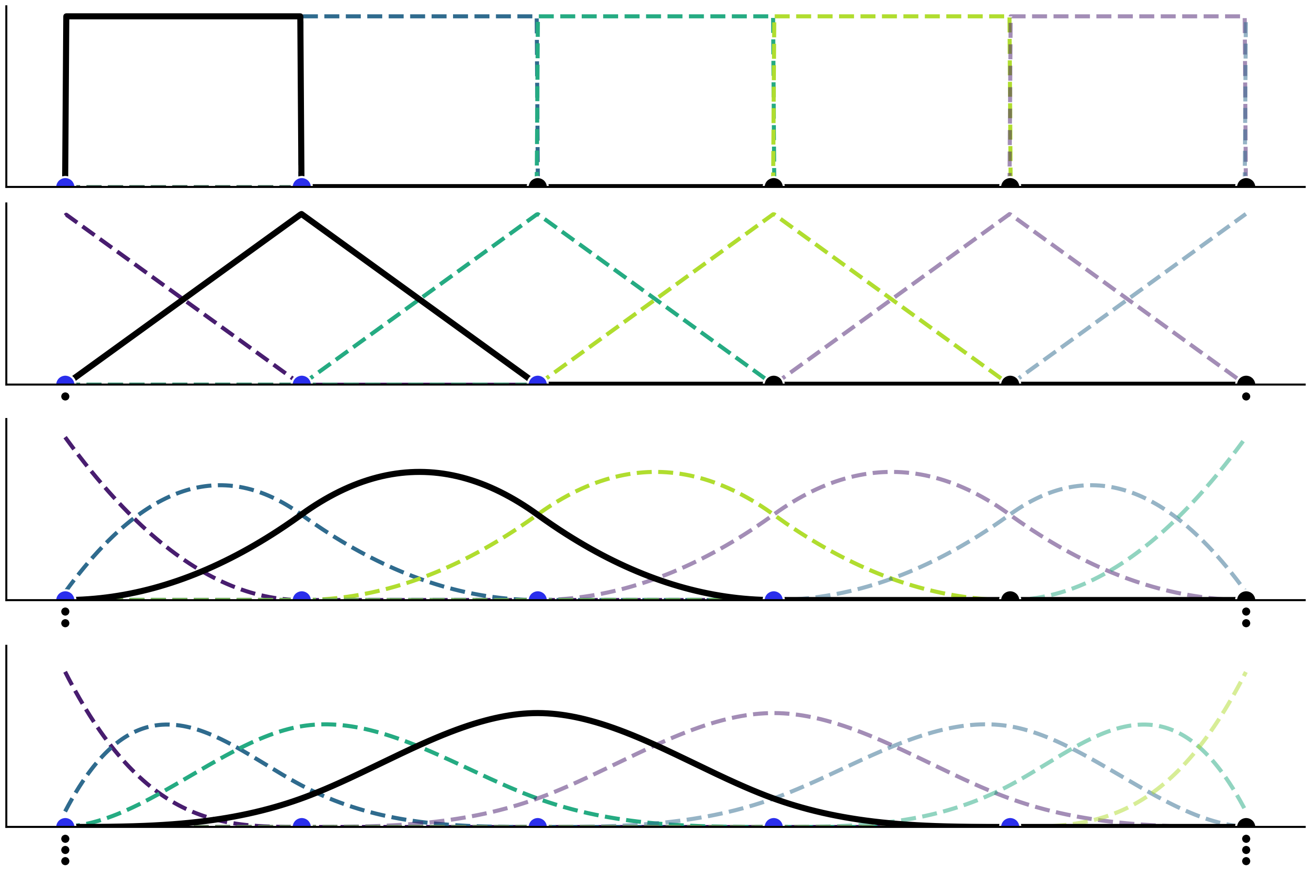
Fig. 89 度数逐步增加的基样条,从 \(0\) 度到 \(3\) 度。顶部子图为一个阶梯状的函数,第二个子图为一个三角状的函数,然后是越来越多高斯状的函数。图中在边界处添加了堆叠结点(用较小黑点表示),以便在边界附近有足够数量的结点来构建基样条。
从 Fig. 89 中可以看到,随着基样条度数的增加,基样条的域跨度也越来越大 8。为了使更高度数的样条有意义,也就需要定义更多结点。需要注意的是:在所有情况下,基样条仅在给定区间内取值非 \(0\),而在区间外均取值为 \(0\)。此属性使样条回归比多项式回归更具备 局部性 。
用于构造每个基样条的结点数,也会随着度数增加而增长。这就造成一种边界效应,即对于所有大于 \(0\) 的度数,在边界附近会出现无法定义基样条的现象。因为在边界处的基样条较少,所以样条函数会在边界处受到影响。好在此边界问题很容易解决,只需在边界处复制足够数量的结点即可(参见 Fig. 89 中的小黑点)。举例来说,如果样条的结点集合为 \(\{0,1,2,3,4,5\}\) ,现在想要拟合一个三次样条曲线( 即 Fig. 89 的最后一个子图中 ),那么为解决边界效应问题,我们实际使用的节点集合应当为 \(\{0,0,0,0,1,2,3,4,5,5,5,5\}\) 。也就是说,在起点填充了 \(3\) 次结点 \(0\) ,在终点填充了 \(3\) 次结点 \(5\)。通过这种方法,就可以有五个必要结点 \(\{0,0,0,0,1\}\) 来定义第一个基样条( Fig. 89 最后一个子图中类似指数分布的靛蓝色虚线 );然后使用结点 \(\{0,0,0,1,2\}\) 来定义第二个基样条( 类似 Beta 分布的那条曲线 ),以此类推。请读者注意观察由结点集合 \(\{0,1,2,3,4\}\) 定义的第一个非堆叠的、完整的基样条( 黑色实线 )。在边界处需要填充的结点数,应当与样条的度数保持一致,因此 \(0\) 度样条无需对堆叠结点,而 \(3\) 度样条需要在头尾共堆叠 \(6\) 个结点。
5.3.2 用基样条构造复杂样条de
使用 Patsy 软件包定义的基样条。在第一行中可以看到以灰色虚线表示的 \(1\) 阶(分段常数)、\(2\) 阶(分段线性)和 \(4\) 阶(分段三次)样条曲线。为了清楚起见,每个基样条都用不同的颜色表示。在第二行中,将第一行的基样条按一组系数加权,粗黑线表示了这些基样条的加权和。需要注意的是,图中的系数值是随机生成的,因此第二行中每个图中的粗黑线,都只能被视为 样条空间 中的一个随机样本。
在这个例子中,我们从半高斯分布(代码 [splines_patsy_plot](splines_patsy_plot) 中的第 $17$ 行)中采样生成 $\beta_i$ 系数。因此,{numref}`fig:splines_weighted` 中的每个子图仅显示了样条空间中的一种实现。你可以删除随机种子,然后多运行代码 [splines_patsy_plot](splines_patsy_plot) 几次,每次你都会看到不同的样条曲线。此外,你还可以尝试将半高斯分布替换为高斯分布、指数分布等其他分布。{numref}`fig:splines_realizations` 中显示了三次样条的四种可能的实现。

```{figure} figures/splines_realizations.png
:name: fig:splines_realizations
:width: 8.00in

从半高斯分布中采样得到 $\beta_i$ 系数的四种三次样条实现。
三次样条(或四阶样条)是样条中的王者
在所有可能的样条中,三次样条是最常用的。但为什么三次样条曲线是样条曲线的王者呢?图 Fig. 88 和 fig:splines_weighted 提供了一些提示。三次样条曲线为我们提供了能够为大多数场景生成 足够平滑 曲线所需的最低阶样条曲线,从而降低了更高阶样条曲线对人们的吸引力。所谓 足够平滑 是什么意思?在不深入数学细节的情况下,其大致意思是拟合的函数不会出现斜率的突然变化。这样做的一种方法是添加两个连续的分段多项式应该在其公共结点处相遇的约束条件,而三次样条另外增加了两个约束:其在结点处的一阶和二阶导数都是连续的。这意味着斜率在结点处是连续的,并且斜率的斜率也连续 9。事实上,\(m\) 度的样条曲线在结点处会有 \(m-1\) 阶导数。尽管说了这么多,低阶或高阶样条对于某些特定问题还是有用的,只是三次样条是很好的默认值。
5.4 使用 Patsy 软件包构建设计矩阵
在图 Fig. 89 和 fig:splines_weighted 中,我们绘制了基样条线,但一直没有提到如何计算它们,主要原因是样条的计算很麻烦,并且在 Scipy 10 等软件包中已经有有效的可用算法。因此,我们不打算从头开始计算基样条,而是依赖 Patsy 软件包,这是一个用于描述统计模型(尤其是线性模型,或具有线性组件的模型)和构建设计矩阵的包。其灵感来自 R 编程语言生态系统的许多包中广泛使用的 形式化迷你语言 。例如,具有两个预测变量的线性模型看起来类似"y ~ x1 + x2",如果想添加交互,可以写成"y ~ x1 + x2 + x1:x2"。这与 第 3 章 中提到的 Bambi 语法有相似之处。有关详细信息,请查看 patsy 文档 11。
要在 Patsy 中定义基样条设计矩阵,我们需要将以 bs() 开头的字符串 粒子 传递给 dmatrix 函数,该粒子是一个能够被 Patsy 解析为函数的字符串。因此,它可以接受多个参数,包括数据、样条结点数组、样条的度数等。在代码 splines_patsy 中,我们定义了 \(3\) 个设计矩阵,第一个为 \(0\) 次样条(分段常数),第二个为 \(1\) 次样条(分段线性),最后一个为 \(3\) 次样条。
x = np.linspace(0., 1., 500)
knots = [0.25, 0.5, 0.75]

B0 = dmatrix("bs(x, knots=knots, degree=0, include_intercept=True) - 1",
             {"x": x, "knots":knots})
B1 = dmatrix("bs(x, knots=knots, degree=1, include_intercept=True) - 1",
             {"x": x, "knots":knots})
B3 = dmatrix("bs(x, knots=knots, degree=3,include_intercept=True) - 1",
             {"x": x, "knots":knots})
Fig. 90 表示使用代码 splines_patsy 计算的 \(3\) 个设计矩阵。为了更好地掌握 Patsy 在做什么,建议你使用 Jupyter notebook/lab 或其他 IDE 来检查对象 B0、B1 和 B2。
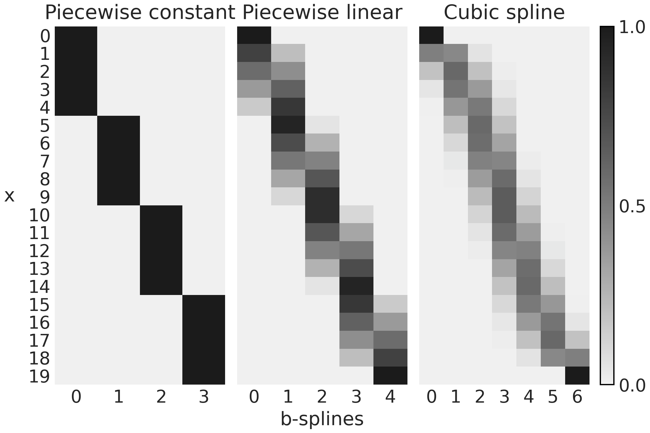
Fig. 90 在代码 splines_patsy 中使用 Patsy 生成的设计矩阵。颜色从黑色 ( \(1\) ) 变为浅灰色 ( \(0\) ),列数是基样条数,行数是数据点数。
Fig. 90 的第一个子图对应于 B0,一个 \(0\) 次样条曲线。对于前 \(5\) 个观测值,我们可以看到设计矩阵是一个只有 \(0\)(浅灰色)和 \(1\)(黑色)的矩阵。第一个基样条(第 \(0\) 列)为 \(1\),否则为 \(0\),对于前 \(5\) 个观测值,第二个基样条(第 \(1\) 列)为 \(0\),对于后 \(5\) 个观测值为 \(1\),再次为 \(0\)。并且重复相同的模式。将此与 fig:splines_weighted 的第一个子图(第一行)进行比较,你应该会看到设计矩阵如何编码该图。
对于 Fig. 90 中的第二个子图,我们有第一个基样条从 \(1\) 到 \(0\),第二、第三和第四个基样条从 \(0\) 到 \(1\),然后从 \(1\) 到 \(0\)。第五个基样条从 \(0\) 到 \(1\)。你可以在 fig:splines_weighted 的第二个子图(第一行)中看到与此模式匹配的一条负斜率的线、三个三角函数和一条正斜率的线。
最后,如果我们比较 Fig. 90 的第三个子图中的 \(7\) 个列与 fig:splines_weighted 的第三个子图(第一行)中的 \(7\) 条曲线,可以看到匹配的类似结果。
代码 splines_patsy 用于生成图 fig:splines_weighted 和 Fig. 90 中的基样条,唯一不同的是前者使用了 x = np .linspace(0., 1., 500),所以曲线看起来更平滑,而后者使用了 x = np.linspace(0., 1., 20),这样矩阵更容易理解。
_, axes = plt.subplots(2, 3, sharex=True, sharey="row")
for idx, (B, title) in enumerate(zip((B0, B1, B3),
                                     ("Piecewise constant",
                                      "Piecewise linear",
                                      "Cubic spline"))):
    # plot spline basis functions
    for i in range(B.shape[1]):
        axes[0, idx].plot(x, B[:, i],
                          color=viridish[i], lw=2, ls="--")
    # we generate some positive random coefficients
    # there is nothing wrong with negative values
    β = np.abs(np.random.normal(0, 1, size=B.shape[1]))
    # plot spline basis functions scaled by its β
    for i in range(B.shape[1]):
        axes[1, idx].plot(x, B[:, i]*β[i],
                          color=viridish[i], lw=2, ls="--")
    # plot the sum of the basis functions
    axes[1, idx].plot(x, np.dot(B, β), color="k", lw=3)
    # plot the knots
    axes[0, idx].plot(knots, np.zeros_like(knots), "ko")
    axes[1, idx].plot(knots, np.zeros_like(knots), "ko")
    axes[0, idx].set_title(title)
到目前为止,我们已经探索了几个示例,以直观了解样条是什么以及如何在 Patsy 的帮助下自动创建它们。下一步可以看一下如何对样条模型进行拟合,以获得权重参数的分布。
5.5 在 PYMC3 中拟合样条
在本节中,我们使用 PYMC3 来将一组基样条拟合到观测数据上,进而获得回归系数 \(\beta\) 的值。本节采用的例子是现代共享单车系统。
现代共享单车系统允许人们以完全自动化的方式租用和归还自行车,有助于提高公共交通的效率。我们将利用加州大学欧文分校机器学习库 12 的一个共享单车系统数据集,来估计 \(24\) 小时内每小时的自行车租用数量。
让我们加载并绘制数据:
data = pd.read_csv("../data/bikes_hour.csv")
data.sort_values(by="hour", inplace=True)

# We standardize the response variable
data_cnt_om = data["count"].mean()
data_cnt_os = data["count"].std()
data["count_normalized"] = (data["count"] - data_cnt_om) / data_cnt_os
# Remove data, you may later try to refit the model to the whole data
data = data[::50]
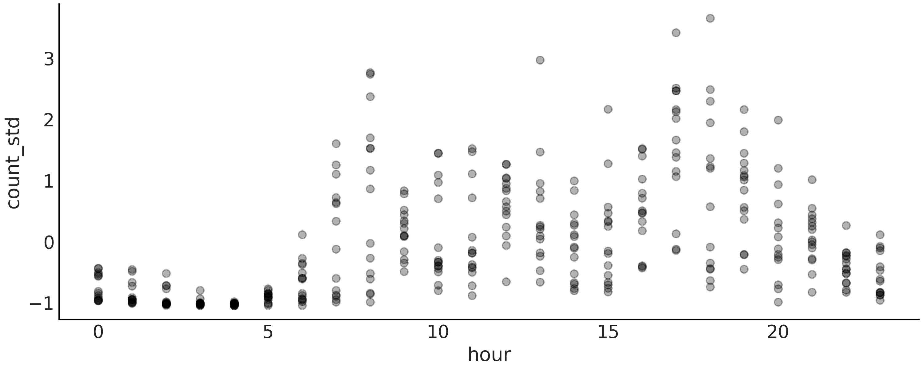
Fig. 91 自行车数据的可视化。每个点是一天中每小时的自行车租用标准化值(在区间 \(0\)、\(23\) 上)。这些点是半透明的,以避免点过度重叠,从而有助于查看数据的分布。
快速查看 Fig. 91 会发现,一天中的时间与出租自行车数量之间的关系并不能通过拟合一条线来很好地捕捉到。因此,让我们尝试使用样条回归来更好地逼近非线性模式。
正如我们已经提到的,为了使用样条曲线,我们需要定义结点的数量和位置。我们将使用 6 个结点并使用最简单的选项来定位它们,每个结点之间的间距相等。
num_knots = 6
knot_list = np.linspace(0, 23, num_knots+2)[1:-1]
请注意,在代码 knot_list 中,我们定义了 8 个结点,但随后我们删除了第一个和最后一个结点,确保保留在数据的 interior 中定义的 6 个结点。这是否是一个有用的策略将取决于数据。例如,如果大部分数据远离边界,这将是一个好主意,结点的数量越大,它们的位置就越不重要。
现在我们使用 Patsy 为我们定义和构建设计矩阵:
B = dmatrix(
    "bs(cnt, knots=knots, degree=3, include_intercept=True) - 1",
    {"cnt": data.hour.values, "knots": knot_list[1:-1]})
建议的统计模型是:
我们的样条回归模型与第 3 章中的线性模型非常相似。所有的工作都是由设计矩阵 \(\boldsymbol{B}\) 及其对特征空间的扩展完成的。请注意,我们使用线性代数符号将公式 (43) 和 (44) 的乘法和求和写成更短的形式,即我们写成 \(\boldsymbol{\mu} = \boldsymbol{B}\boldsymbol{\beta}\) 而不是 \(\boldsymbol{\mu} = \sum_i^n B_i \boldsymbol{\beta}_i\)。
像往常一样,统计语法以几乎一对一的方式翻译成 PyMC3。
with pm.Model() as splines:
    τ = pm.HalfCauchy("τ", 1)
    β = pm.Normal("β", mu=0, sd=τ, shape=B.shape[1])
    μ = pm.Deterministic("μ", pm.math.dot(B, β))
    σ = pm.HalfNormal("σ", 1)
    c = pm.Normal("c", μ, σ, observed=data["count_normalized"].values)
    idata_s = pm.sample(1000, return_inferencedata=True)
我们在 Fig. 92 中将最终拟合的线性预测显示为黑色实线,每个加权基样条显示为虚线。这是一个很好的表示,因为我们可以看到基样条如何影响最终结点果。
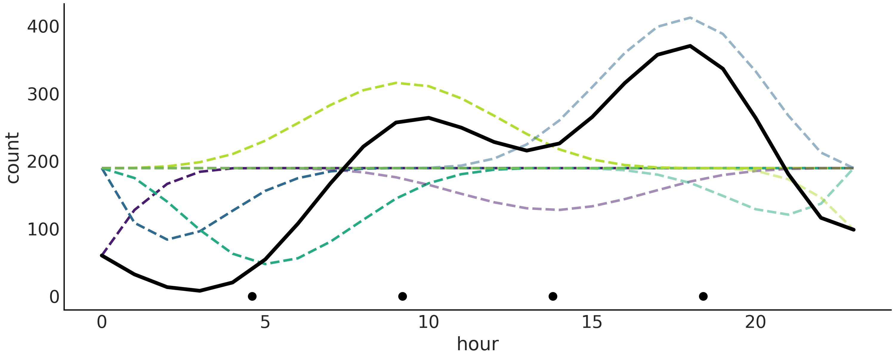
Fig. 92 使用样条拟合的自行车数据。 B样条用虚线表示。它们的总和产生更粗的黑色实线。
绘制的值对应于后验的均值。黑点代表结点。相对于 fig:splines_weighted 中绘制的样条线,此图中的样条线看起来非常锯齿状。原因是我们在更少的点上评估函数。此处为 24 分,因为数据每小时分箱,而 fig:splines_weighted 中的数据为 500。
当我们想要显示模型的结果时,更有用的绘图是使用重叠样条及其不确定性绘制数据,如 Fig. 93。从这个图中我们可以很容易地看出,在深夜租用自行车的数量是最低的。然后有增加,可能随着人们醒来并去工作。我们在 10 小时左右出现第一个高峰,然后趋于平稳,或者可能略有下降,然后在 18 小时左右人们通勤回家时出现第二个高峰,之后稳步下降。
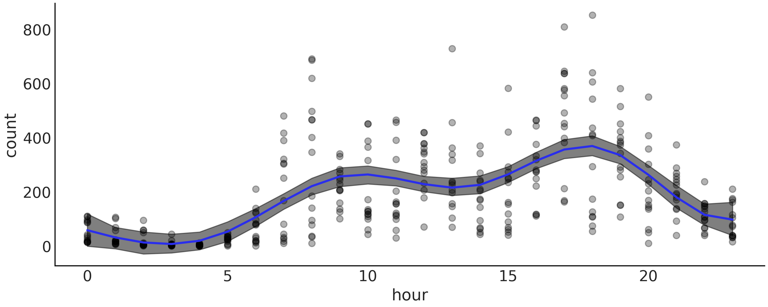
Fig. 93 使用样条拟合的自行车数据(黑点)。阴影曲线代表 \(94\%\) HDI 区间(均值),蓝色曲线代表平均趋势。
在这个自行车租赁示例中,我们正在处理一个循环变量,这意味着 0 小时等于 24 小时。这对我们来说可能或多或少是显而易见的,但对于我们的模型来说绝对不明显。 Patsy 提供了一个简单的解决方案来告诉我们的模型变量是循环的。我们可以使用 cc 来代替使用 bs 定义设计矩阵,这是一个圆形感知的三次样条。我们建议你查看 Patsy 文档以获取更多详细信息,并探索在以前的模型中使用 cc 并比较结果。
5.6 选择样条的结点和先验
5.6.1 样条结点的选择
在使用样条曲线时,我们必须做出的一项建模决策,是选择结点数量和结点位置。这可能有点令人担忧,因为结点数量和它们的间距不是很好确定。当面临这种情形时,可以尝试拟合多个模型,然后使用 LOO 等方法来帮助我们选择最佳模型。
Table 12 显示了模型拟合的结果,如代码 splines 中定义的模型,具有 \(3\)、\(6\)、\(9\)、\(12\) 和 \(18\) 个等距结点,可以看到 LOO 选择了 \(12\) 个结点的样条曲线作为最佳模型。
Table 12 中有一个有趣现象:模型 m_12k(秩最高的模型)的权重为 \(0.88\) ,模型 m_3k(秩最后的模型)的权重为 \(0.12\) 。而其余模型的权重几乎为 \(0\) 。如 2.6 模型平均 节中解释的,默认情况下,权重是使用堆叠计算的。堆叠尝试在一个元模型中组合多个模型,以最小化该元模型和 真实 生成模型之间的散度。作为结果,即便模型 m_6k、 m_9k 和 m_18k 均具有更好的 loo 值,但一旦元模型中已经包含了模型 m_12k,则它们并没也添加太多新的信息;与之相对的,模型 m_3k 的秩最低,但它似乎可以为模型平均做出一些额外的贡献。
Fig. 94 显示了所有模型的平均拟合样条曲线。
rank |
loo |
p_loo |
d_loo |
weight |
se |
dse |
warning |
loo_scale |
|
m_12k |
0 |
-377.67 |
14.21 |
0.00 |
0.88 |
17.86 |
0.00 |
False |
log |
m_18k |
1 |
-379.78 |
17.56 |
2.10 |
0.00 |
17.89 |
1.45 |
False |
log |
m_9k |
2 |
-380.42 |
11.43 |
2.75 |
0.00 |
18.12 |
2.97 |
False |
log |
m_6k |
3 |
-389.43 |
9.41 |
11.76 |
0.00 |
18.16 |
5.72 |
False |
log |
m_3k |
4 |
400.25 |
7.17 |
22.58 |
0.12 |
18.01 |
7.78 |
False |
log |
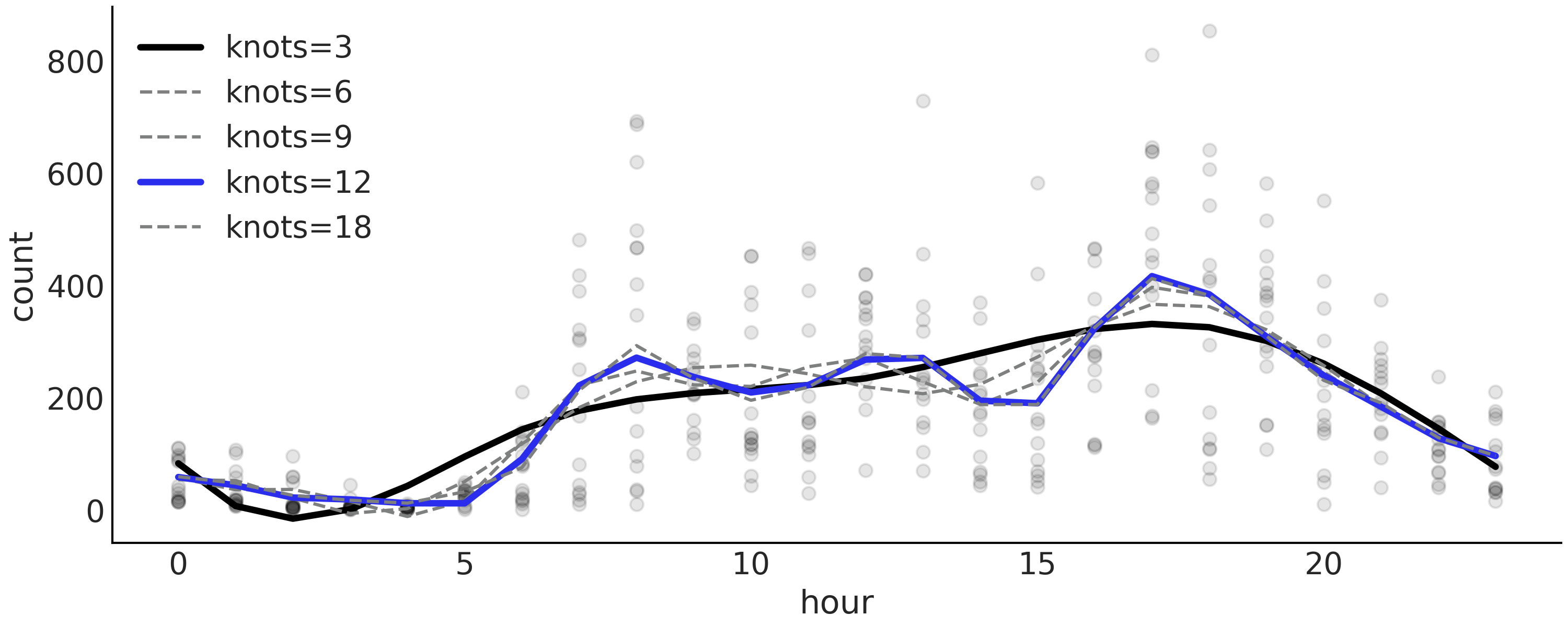
Fig. 94 代码 splines 中描述的,具有不同结点数 \(\{3, 6, 9, 12, 18\}\) 的模型平均后验样条。根据 LOO ,模型 “m_12k” 以蓝色突出显示为秩最高的模型。模型 m_3k 以黑色突出显示,而其余模型则显示为灰色,因为其权重几乎为零(参见 Table 12)。
确定结点位置的一种建议方法,是根据分位数设置结点而不是均匀设置。在代码 knot_list 中,可以使用 knot_list = np.quantile(data.hour, np.linspace(0, 1, num_knots)) 来定义分位数knot_list。这样的话,我们就能够在数据较多的地方设置更多结点,而在数据较少的地方放置更少结点。这为数据更丰富的部分提供了更灵活的近似。
5.6.2 样条的正则化先验
设置过少的结点会导致欠拟合,而设置过多结点又可能会导致过拟合,因此我们希望能够使用具有 恰当 数量的结点,然后选择正则化先验。
从样条的定义和 fig:splines_weighted 可以看出,相邻 \(\boldsymbol{\beta}\) 系数之间越接近,得到的函数就越平滑。想象一下,如果你在 fig:splines_weighted 中删除了设计矩阵的两个相邻列,实际上是将其系数设置为了 \(0\) ,导致拟合的 平滑度 降低,因为在预测变量中缺少足够信息来覆盖一些子区域。因此,通过选择 \(\boldsymbol{\beta}\) 系数的先验,可以实现更平滑的拟合回归线,其中一种方式是使 \(\beta_{i+1}\) 的值与 \(\beta_{i}\) 相关:
使用 PyMC3,可以使用高斯随机游走分布来设置先验,以获得等效版本:
要查看此先验的效果,我们可以再次对自行车数据集进行分析,但这次使用num_knots = 12 。我们使用 splines 模型和以下模型重新拟合数据:
with pm.Model() as splines_rw:
    τ = pm.HalfCauchy("τ", 1)
    β = pm.GaussianRandomWalk("β", mu=0, sigma=τ, shape=B.shape[1])
    μ = pm.Deterministic("μ", pm.math.dot(B, β))
    σ = pm.HalfNormal("σ", 1)
    c = pm.Normal("c", μ, σ, observed=data["count_normalized"].values)
    trace_splines_rw = pm.sample(1000)
在 Fig. 95 中,可以看到模型 splines_rw(黑线)的均值函数比没有平滑先验的均值函数(灰色粗线)波动更小,尽管差异非常小。
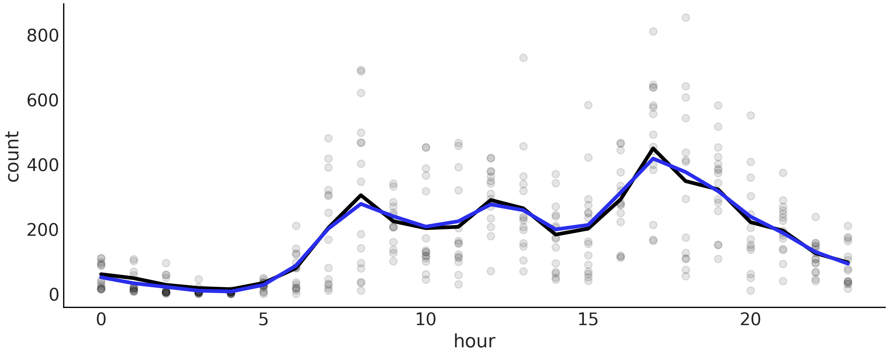
Fig. 95 使用高斯先验(黑色)和正则化高斯随机游走先验(蓝色)拟合的自行车数据。两种情况都使用了 \(22\) 个结点。黑线对应于从 splines 模型计算的均值函数。蓝线是模型 splines_rw 对应的均值函数。
5.7 用样条对 \(CO_2\) 吸收量建模
作为样条曲线的最后一个例子,我们将使用来自实验研究的数据 [50, 51]。该实验测量了 \(12\) 种不同植物在不同条件下的二氧化碳吸收量。这里我们主要探索 \(CO_2\) 的汇聚效应,即环境中的 \(CO_2\) 浓度对不同植物二氧化碳吸收能力的影响。实验为 \(12\) 类植物中的每一类分别在 \(7\) 个 \(CO_2\) 浓度下测量了 \(CO_2\) 吸收量。
让我们从加载和整理数据开始:
plants_CO2 = pd.read_csv("../data/CO2_uptake.csv")
plant_names = plants_CO2.Plant.unique()

# Index the first 7 CO2 measurements per plant
CO2_conc = plants_CO2.conc.values[:7]

# Get full array which are the 7 measurements above repeated 12 times
CO2_concs = plants_CO2.conc.values
uptake = plants_CO2.uptake.values

index = range(12)
groups = len(index)
我们要拟合的第一个模型假设所有 \(12\) 类植物的结果曲线相同。首先使用 Patsy 定义设计矩阵,就像之前做的那样。由于每种植物仅有 \(7\) 个观测值,所以我们设置 num_knots=2 应该也可以正常工作。在代码 plants_co2_import 中,CO2_concs 是一个二氧化碳浓度列表,其值 [95, 175, 250, 350, 500, 675, 1000] 共重复 \(12\) 次,每次分别对应一类植物。
num_knots = 2
knot_list = np.linspace(CO2_conc[0], CO2_conc[-1], num_knots+2)[1:-1]

Bg = dmatrix(
    "bs(conc, knots=knots, degree=3, include_intercept=True) - 1",
    {"conc": CO2_concs, "knots": knot_list})
这个问题看起来类似于前面章节中的自行车租赁问题,因此可以从相同的模型开始。
使用我们已经在以前的问题中应用过的模型或我们从文献中学到的模型是开始分析的好方法。这种模型-模板方法可以被视为模型设计过程的捷径 [17]。除了不必从头开始考虑模型的明显优势之外,我们还有其他优势,例如对如何执行模型的探索性分析有更好的直觉,然后可以对模型进行修改以简化它或使它更复杂。
with pm.Model() as sp_global:
    τ = pm.HalfCauchy("τ", 1)
    β = pm.Normal("β", mu=0, sigma=τ, shape=Bg.shape[1])
    μg = pm.Deterministic("μg", pm.math.dot(Bg, β))
    σ = pm.HalfNormal("σ", 1)
    up = pm.Normal("up", μg, σ, observed=uptake)
    idata_sp_global = pm.sample(2000, return_inferencedata=True)
从 Fig. 96 中可以清楚地看到,该模型只为某些植物提供了良好的拟合。该模型平均而言是好的,但对于特定植物来说并不是太好。
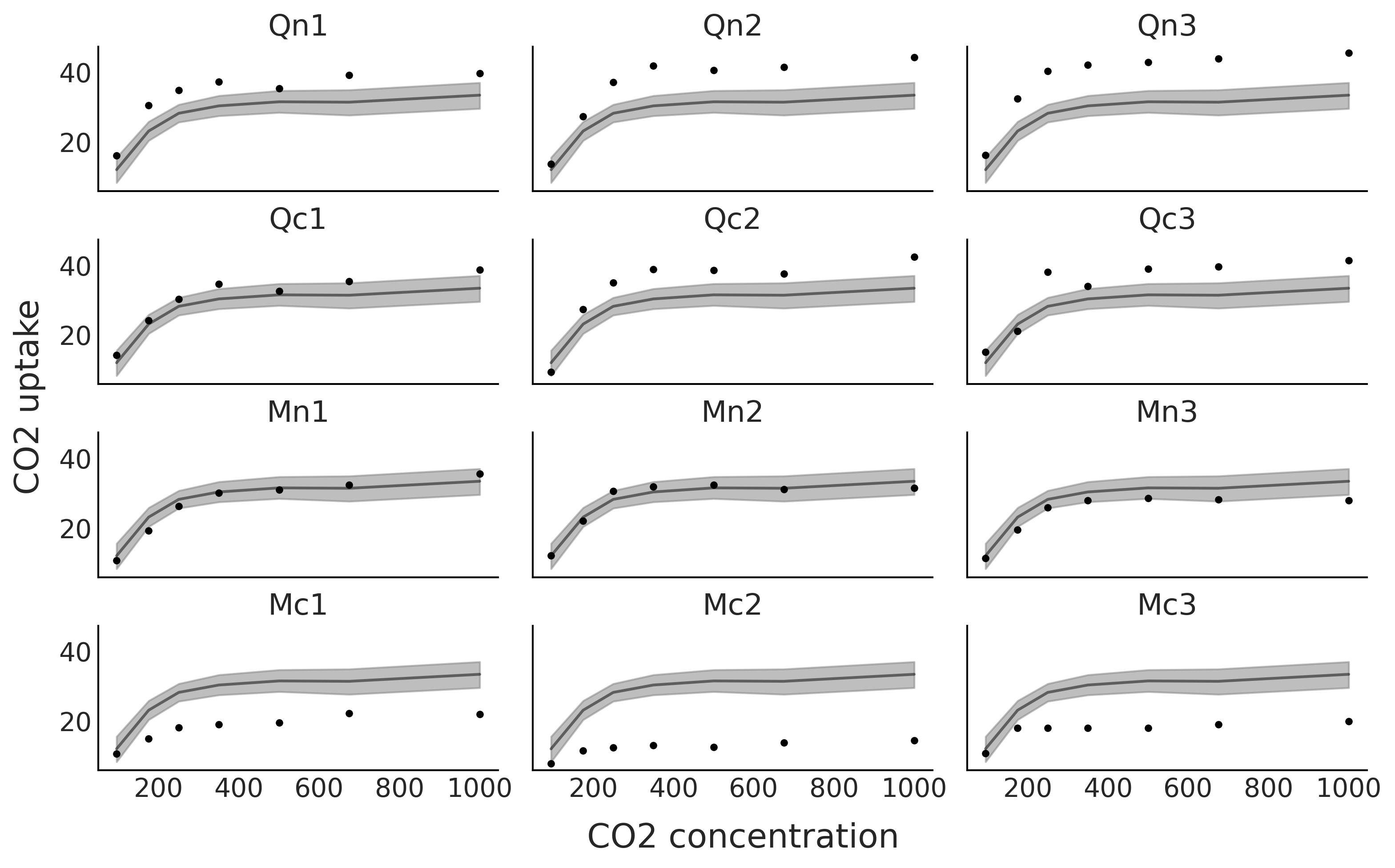
Fig. 96 黑点代表 \(12\) 种植物(Qn1、Qn2、Qn3、Qc1、Qc2、Qc3、Mn1、Mn2、Mn3、Mc1、Mc2、Mc3)在 \(7\) 个 \(CO_2\) 浓度下测量的 \(CO_2\) 吸收量。黑线是代码 sp_global 中模型的均值样条拟合,灰色阴影曲线表示该拟合的 \(94\%\) 高密度区间。
现在让我们尝试使用每种植物具有不同结果的模型,为此在代码 Bi_matrix 中定义了设计矩阵 Bi 。 Bi 使用列表 CO2_conc = [95, 175, 250, 350, 500, 675, 1000],因此是一个 \(7 \times 7\) d的矩阵,而 Bg 是一个 \(84 \times 7\) 矩阵。
Bi = dmatrix(
    "bs(conc, knots=knots, degree=3, include_intercept=True) - 1",
    {"conc": CO2_conc, "knots": knot_list})
对应于 Bi 的形状,代码 sp_individual 中的参数 \(\beta\) 具有形状 shape=(Bi.shape[1], groups))( 不是 shape=(Bg .shape[1]))) ,并且做整形操作 μi[:,index].T.ravel()。
with pm.Model() as sp_individual:
    τ = pm.HalfCauchy("τ", 1)
    β = pm.Normal("β", mu=0, sigma=τ, shape=(Bi.shape[1], groups))
    μi = pm.Deterministic("μi", pm.math.dot(Bi, β))
    σ = pm.HalfNormal("σ", 1)
    up = pm.Normal("up", μi[:,index].T.ravel(), σ, observed=uptake)
    idata_sp_individual = pm.sample(2000, return_inferencedata=True)
从 Fig. 97 中可以看到,我们对 \(12\) 种植物中的每一种都有了更好的拟合。
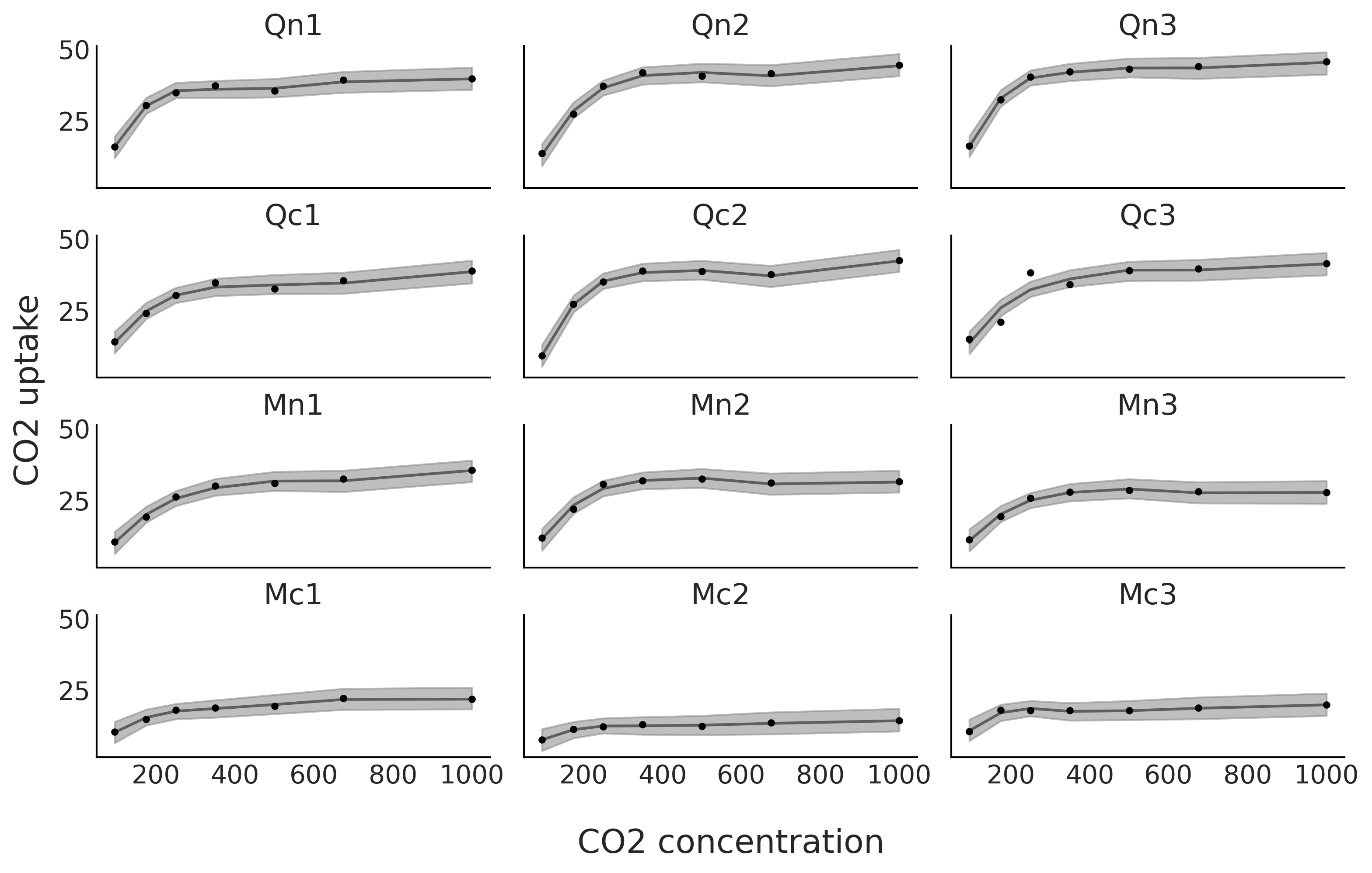
Fig. 97 在 \(12\) 种植物的 \(7\) 个 \(CO_2\) 浓度下测量的 \(CO_2\) 吸收量。黑线是代码 sp_individual 中模型的均值样条拟合,灰色阴影曲线表示该拟合的 \(94\%\) 高密度区间。
我们还可以混合前面两种模型 13。当我们想估计 \(12\) 种植物的整体趋势和各自的拟合时,这会非常有趣。代码 sp_mix 中的模型 sp_mix 使用了先前定义的设计矩阵 Bg 和 Bi。
with pm.Model() as sp_mix:
    τ = pm.HalfCauchy("τ", 1)
    βg = pm.Normal("βg", mu=0, sigma=τ, shape=Bg.shape[1])
    μg = pm.Deterministic("μg", pm.math.dot(Bg, βg))
    βi = pm.Normal("βi", mu=0, sigma=τ, shape=(Bi.shape[1], groups))
    μi = pm.Deterministic("μi", pm.math.dot(Bi, βi))
    σ = pm.HalfNormal("σ", 1)
    up = pm.Normal("up", μg+μi[:,index].T.ravel(), σ, observed=uptake)
    idata_sp_mix = pm.sample(2000, return_inferencedata=True)
Fig. 98 显示了模型 sp_mix 的拟合结果。该模型的一个优点是可以将各种植物的拟合(蓝色)分解为两项,一项是全局趋势,表示为黑色,另一项是每种植物的偏差趋势,表示为灰色。注意黑色的全局趋势在每个子图中是重复的。偏差不仅在平均吸收量上有所不同(即它们不是扁平的直线),而且它们的函数相应形状也在不同程度上存在区别。
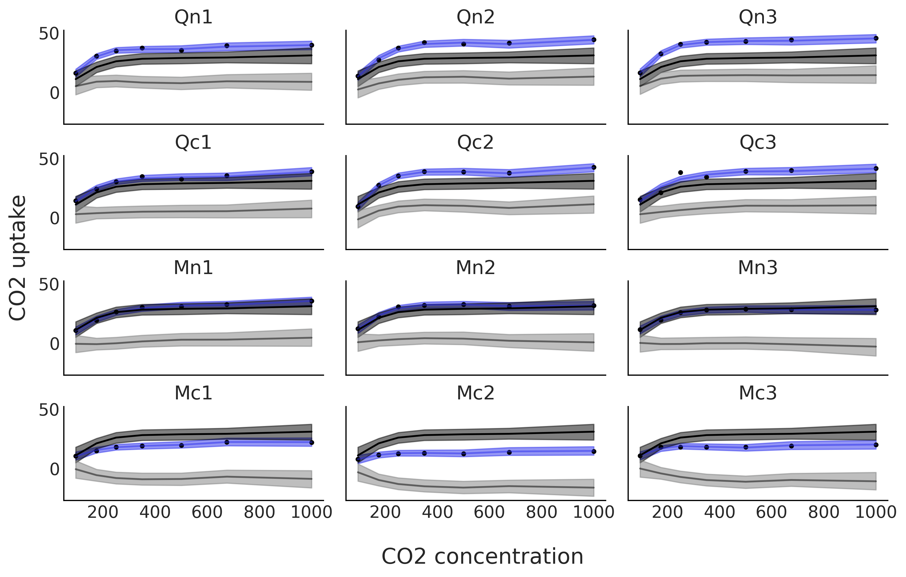
Fig. 98 在 \(12\) 种植物的 \(7\) 种 \(CO_2\) 浓度下测量的 \(CO_2\) 吸收量。蓝线是代码 sp_mix 中模型的均值样条拟合,灰色阴影曲线表示该拟合的 \(94\%\) HDI 区间。这种拟合被分解为两项。黑色和深灰色带表示全局贡献,灰色和浅灰色带表示与全局贡献的偏差。蓝线和蓝带是全局趋势及其偏差的总和。
Fig. 99 表明根据 LOO sp_mix 是比其他两个更好的模型。我们可以看到,由于sp_mix 和 sp_individual 模型的标准误差部分重叠,因此该指定仍然存在一些不确定性。我们还可以看到,模型 sp_mix 和 sp_individual 比 sp_global 受到更严重的惩罚( sp_global 的空圆圈和黑色圆圈之间的距离更短)。我们注意到 LOO 计算返回关于帕累托分布的估计形状参数大于 \(0.7\) 的警告。对于此示例,我们将在此停止,但为了进行真正的分析,应该进一步注意这些警告,并尝试遵循第 2.5.4 帕累托形状参数 \hat \kappa 部分中描述的一些操作。
cmp = az.compare({"global":idata_sp_global,
                  "individual":idata_sp_individual,
                  "mix":idata_sp_mix})
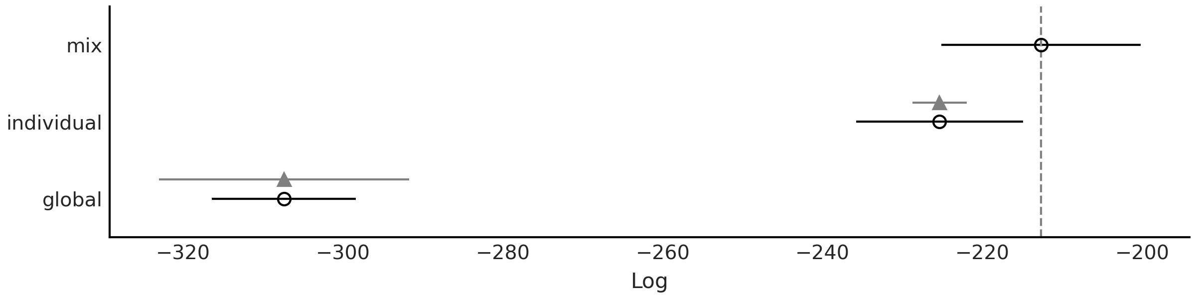
Fig. 99 使用 LOO 对本章讨论的 \(3\) 种不同 \(CO_2\) 吸收模型(sp_global、sp_individual、sp_mix)进行模型比较。模型的预测准确度从高到低排列。空心点代表 LOO 的值,黑点是样本内预测精度。黑色部分代表 LOO 计算的标准误差。以三角形为中心的灰色部分表示每个模型的 LOO 值与秩最佳的模型之间的差值的标准误差。
5.8 练习
5E1.. Splines are quite powerful so its good to know when and where to use them. To reinforce this explain each of the following
The differences between linear regression and splines.
When you may want to use linear regression over splines
Why splines is usually preferred over polynomial regression of high order.
5E2. Redo Fig. 87 but fitting a polynomial of degree 0 and of degree 1. Does they look similar to any other type of model. Hint: you may want to use the code in the GitHub repository.
5E3. Redo Fig. 88 but changing the value of one or the two knots. How the position of the knots affects the fit? You will find the code in the GitHub repository.
5E4. Below we provide some data. To each data fit a 0, 1, and 3 degree spline. Plot the fit, including the data and position of the knots. Use knots = np.linspace(-0.8, 0.8, 4). Describe the fit.
x = np.linspace(-1, 1., 200)andy = np.random.normal(2*x, 0.25)x = np.linspace(-1, 1., 200)andy = np.random.normal(x**2, 0.25)pick a function you like.
5E5. In Code Block bikes_dmatrix we used a non-cyclic aware design matrix. Plot this design matrix. Then generate a cyclic design matrix. Plot this one too what is the difference?
5E6. Generate the following design matrices using Patsy.
x = np.linspace(0., 1., 20)
knots = [0.25, 0.5, 0.75]

B0 = dmatrix("bs(x, knots=knots, degree=3, include_intercept=False) +1",
            {"x": x, "knots":knots})
B1 = dmatrix("bs(x, knots=knots, degree=3, include_intercept=True) +1",
            {"x": x, "knots":knots})
B2 = dmatrix("bs(x, knots=knots, degree=3, include_intercept=False) -1",
            {"x": x, "knots":knots})
B3 = dmatrix("bs(x, knots=knots, degree=3, include_intercept=True) -1",
            {"x": x, "knots":knots})
What is the shape of each one of the matrices? Can you justify the values for the shapes?
Could you explain what the arguments
include_intercept=True/Falseand the+1/-1do? Try generating figures like Fig. 89 and Fig. 90 to help you answer this question
5E7. Refit the bike rental example using the options listed below. Visually compare the results and try to explain the results:
Code Block knot_list but do not remove the first and last knots (i.e. without using 1:-1)
Use quantiles to set the knots instead of spacing them linearly.
Repeat the previous two points but with less knots
5E8. In the GitHub repository you will find the spectra dataset use it to:
Fit a cubic spline with knots
np.quantile(X, np.arange(0.1, 1, 0.02))and a Gaussian prior (like in Code Block splines)Fit a cubic spline with knots
np.quantile(X, np.arange(0.1, 1, 0.02))and a Gaussian Random Walk prior (like in Code Block splines_rw)Fit a cubic spline with knots
np.quantile(X, np.arange(0.1, 1, 0.1))and a Gaussian prior (like in Code Block splines)compare the fits visually and using LOO
5M9. Redo Fig. 88 extending x_max from 6 to 12.
How this change affects the fit?
What are the implications for extrapolation?
add one more knot and make the necessary changes in the code so the fit actually use the 3 knots.
change the position of the third new knot to improve the fit as much as possible.
5M10. For the bike rental example increase the number of knots. What is the effect on the fit? Change the width of the prior and visually evaluate the effect on the fit. What do you think the combination of knot number and prior weights controls?
5M11. Fit the baby regression example from Chapter 4 using splines.
5M12. In Code Block bikes_dmatrix we used a non-circular aware design matrix. Since we describe the hours in a day as cyclic, we want to use cyclic splines. However, there is one wrinkle. In the original dataset the hours range from 0 to 23, so using a circular spline patsy would treat 0 and 23 are the same. Still, we want a circular spline regression so perform the following steps.
Duplicate the 0 hour data label it as 24.
Generate a circular design matrix and a non-circular design matrix with this modified dataset. Plot the results and compare.
Refit the bike spline dataset.
Explain what the effect of the circular spine regression was using plots, numerical summaries, and diagnostics.
5M13. For the rent bike example we use a Gaussian as likelihood, this can be seen as a reasonable approximation when the number of counts is large, but still brings some problems, like predicting negative number of rented bikes (for example, at night when the observed number of rented bikes is close to zero). To fix this issue and improve our models we can try with other likelihoods:
use a Poisson likelihood (hint you may need to restrict the \(\beta\) coefficients to be positive, and you can not normalize the data as we did in the example). How the fit differs from the example in the book. is this a better fit? In what sense?
use a NegativeBinomial likelihood, how the fit differs from the previous two? Could you explain the differences (hint, the NegativeBinomial can be considered as a mixture model of Poisson distributions, which often helps to model overdispersed data)
Use LOO to compare the spline model with Poisson and NegativeBinomial likelihoods. Which one has the best predictive performance?
Can you justify the values of
p_looand the values of \(\hat \kappa\)?Use LOO-PIT to compare Gaussian, NegativeBinomial and Poisson models
5M14. Using the model in Code Block splines as a guide and for \(X \in [0, 1]\), set \(\tau \sim \text{Laplace}(0, 1)\):
Sample and plot realizations from the prior for \(\mu\). Use different number and locations for the knots
What is the prior expectation for \(\mu(x_i)\) and how does it depend on the knots and X?
What is the prior expectation for the standard deviations of \(\mu(x_i)\) and how does it depend on the knots and X?
Repeat the previous points for the prior predictive distribution
Repeat the previous points using a \(\mathcal{H}\text{C}(1)\)
5M15. Fit the following data. Notice that the response variable is binary so you will need to adjust the likelihood accordingly and use a link function.
a logistic regression from a previous chapter. Visually compare the results between both models.
Space Influenza is a disease which affects mostly young and old people, but not middle-age folks. Fortunately, Space Influenza is not a serious concern as it is completely made up. In this dataset we have a record of people that got tested for Space Influenza and whether they are sick (1) or healthy (0) and also their age. Could you have solved this problem using logistic regression?
5M16. Besides “hour” the bike dataset has other covariates, like “temperature”. Fit a splines using both covariates. The simplest way to do this is by defining a separated spline/design matrix for each covariate. Fit a model with a NegativeBinomial likelihood.
Run diagnostics to check the sampling is correct and modify the model and or sample hyperparameters accordingly.
How the rented bikes depend on the hours of the day and how on the temperature?
Generate a model with only the hour covariate to the one with the “hour” and “temperature”. Compare both model using LOO, LOO-PIT and posterior predictive checks.
Summarize all your findings
- 1
See Runge’s phenomenon for details. This can also be seen from Taylor’s theorem, polynomials will be useful to approximate a function close to a single given point, but it will not be good over its whole domain. If you got lost try watching this video https://www.youtube.com/watch?v=3d6DsjIBzJ4.
- 2
A piecewise function is a function that is defined using sub-functions, where each sub-function applies to a different interval in the domain.
- 4
This can also be justified numerically as this reduces the number of coefficients we need to find to compute a solution.
- 5
As usual the identity function is a valid choice.
- 6
Other basis functions could be wavelets or Fourier series as we will see in Chapter 6.
- 7
Also known as break points, which is arguably a more memorable name, but still knots is widely used in the literature.
- 8
In the limit of infinite degree a B-spline will span the entire real line and not only that, it will converge to a Gaussian https://www.youtube.com/watch/9CS7j5I6aOc.
- 9
Check https://pclambert.net/interactivegraphs/spline_continuity/spline_continuity for further intuition
- 10
If interested you can check https://en.wikipedia.org/wiki/De_Boor%27s_algorithm.
- 11
- 12
https://archive.ics.uci.edu/ml/datasets/bike+sharing+dataset
- 13
Yes, this is also known as a mixed-effect model, you might recall the related concept we discussed in Chapter 4.